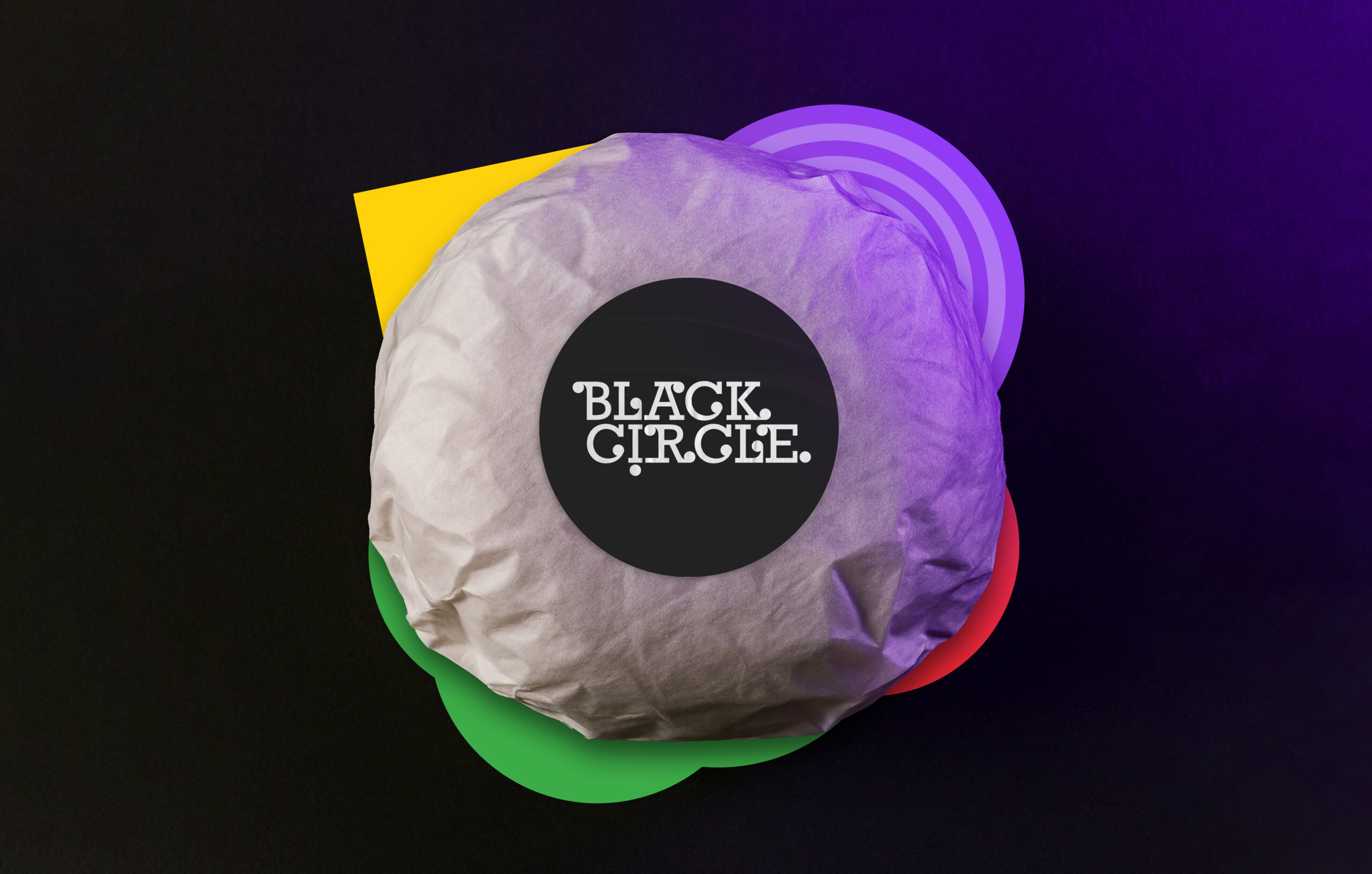
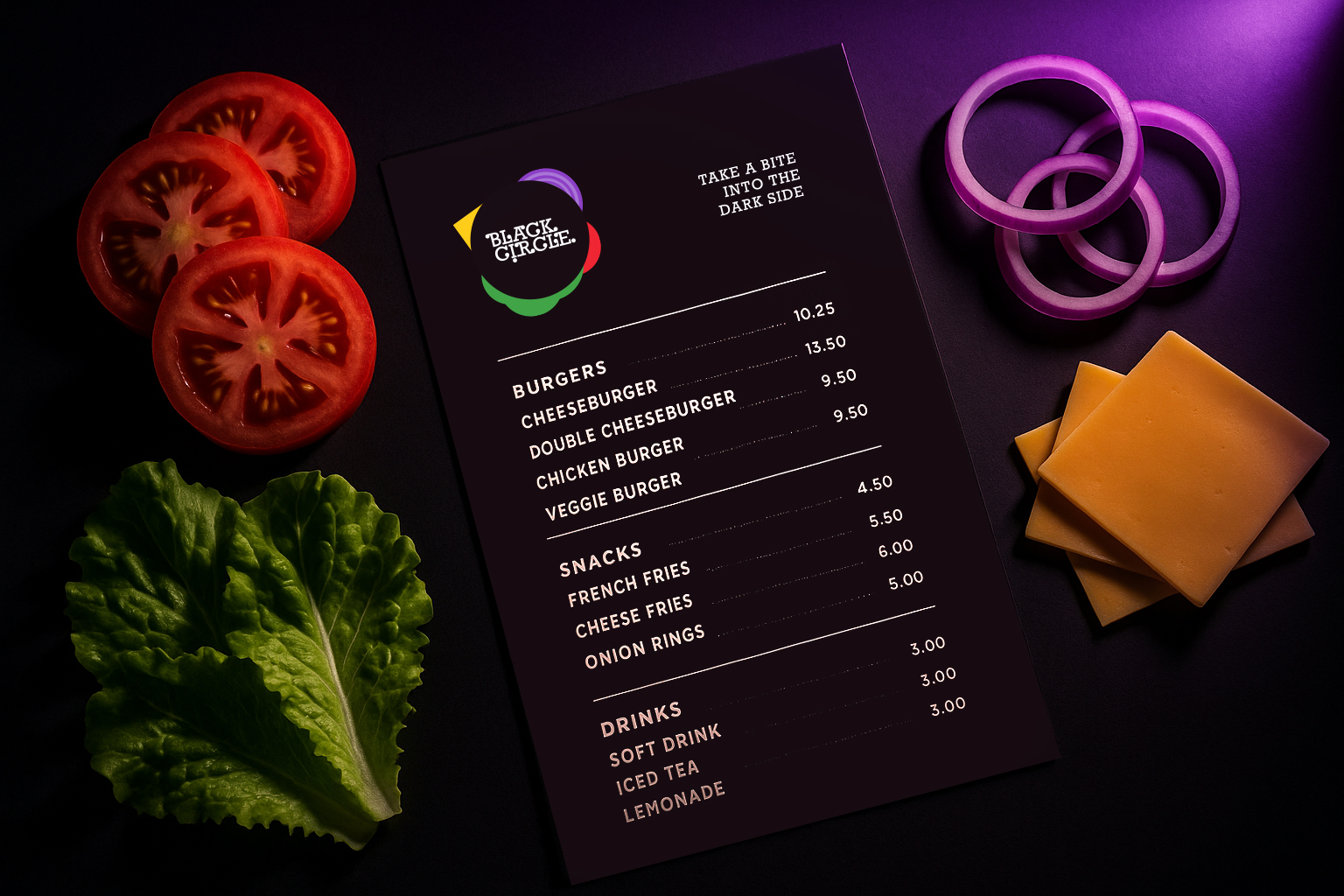
Burgers, Friends, and a Circle of Warmth
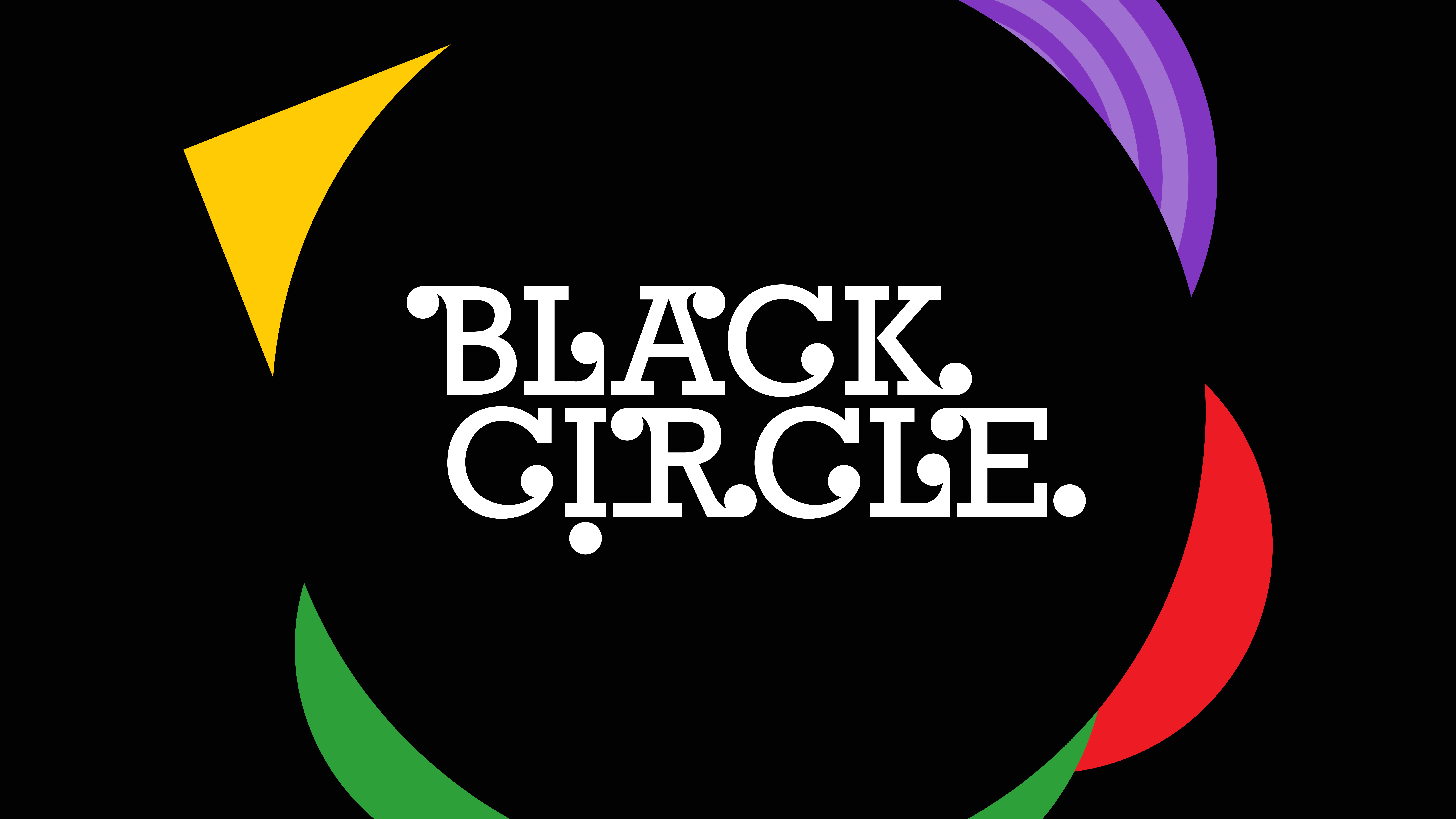
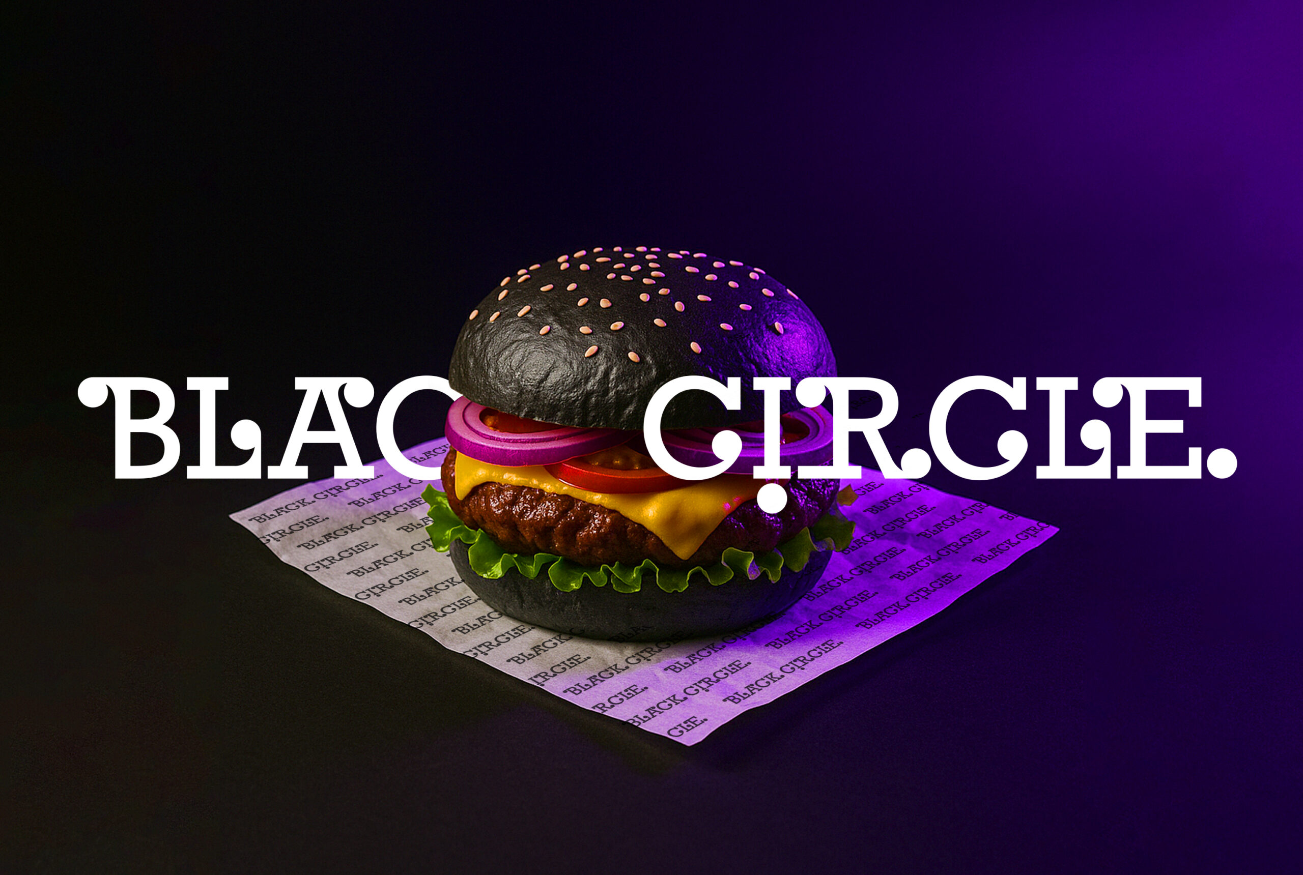
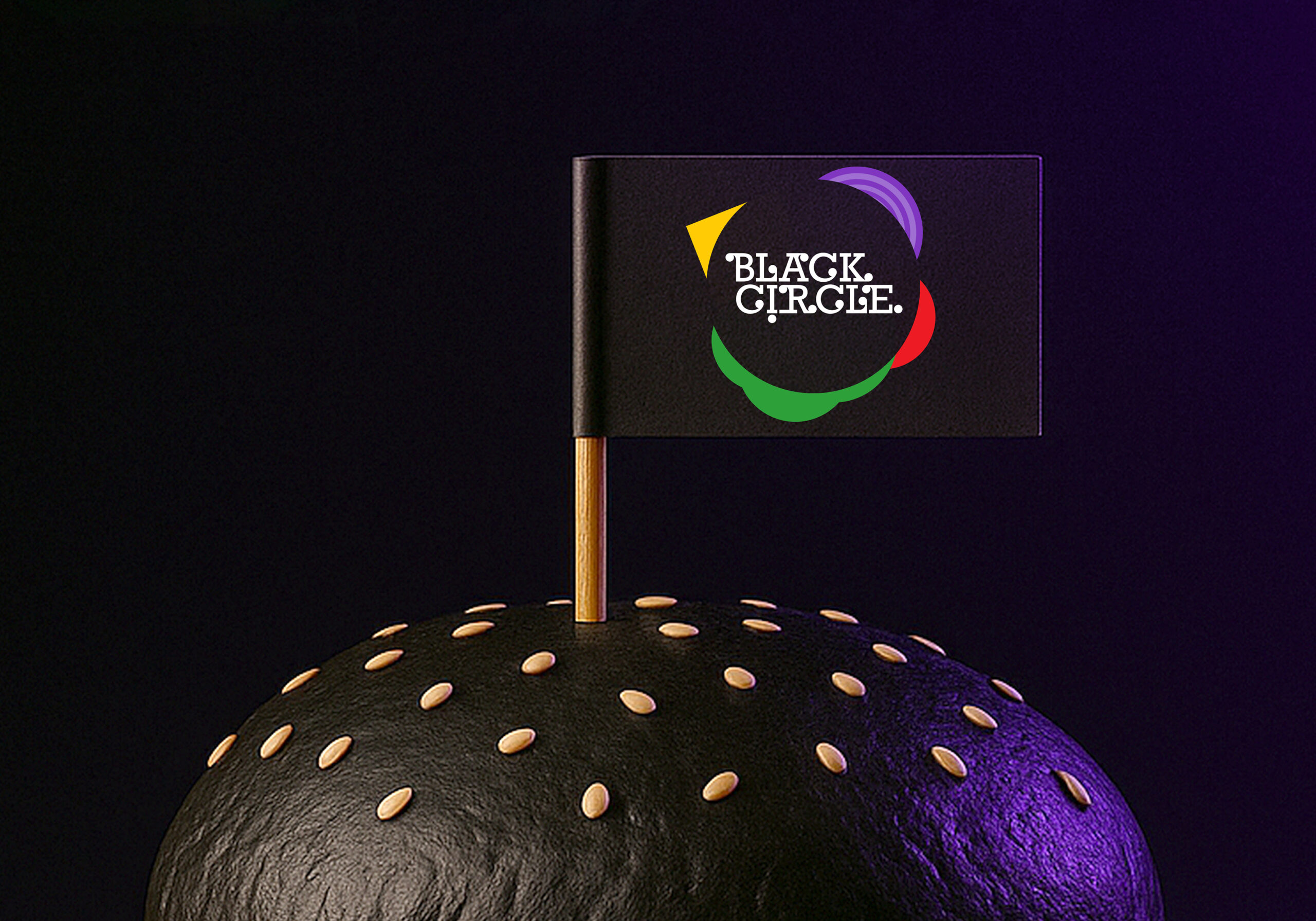
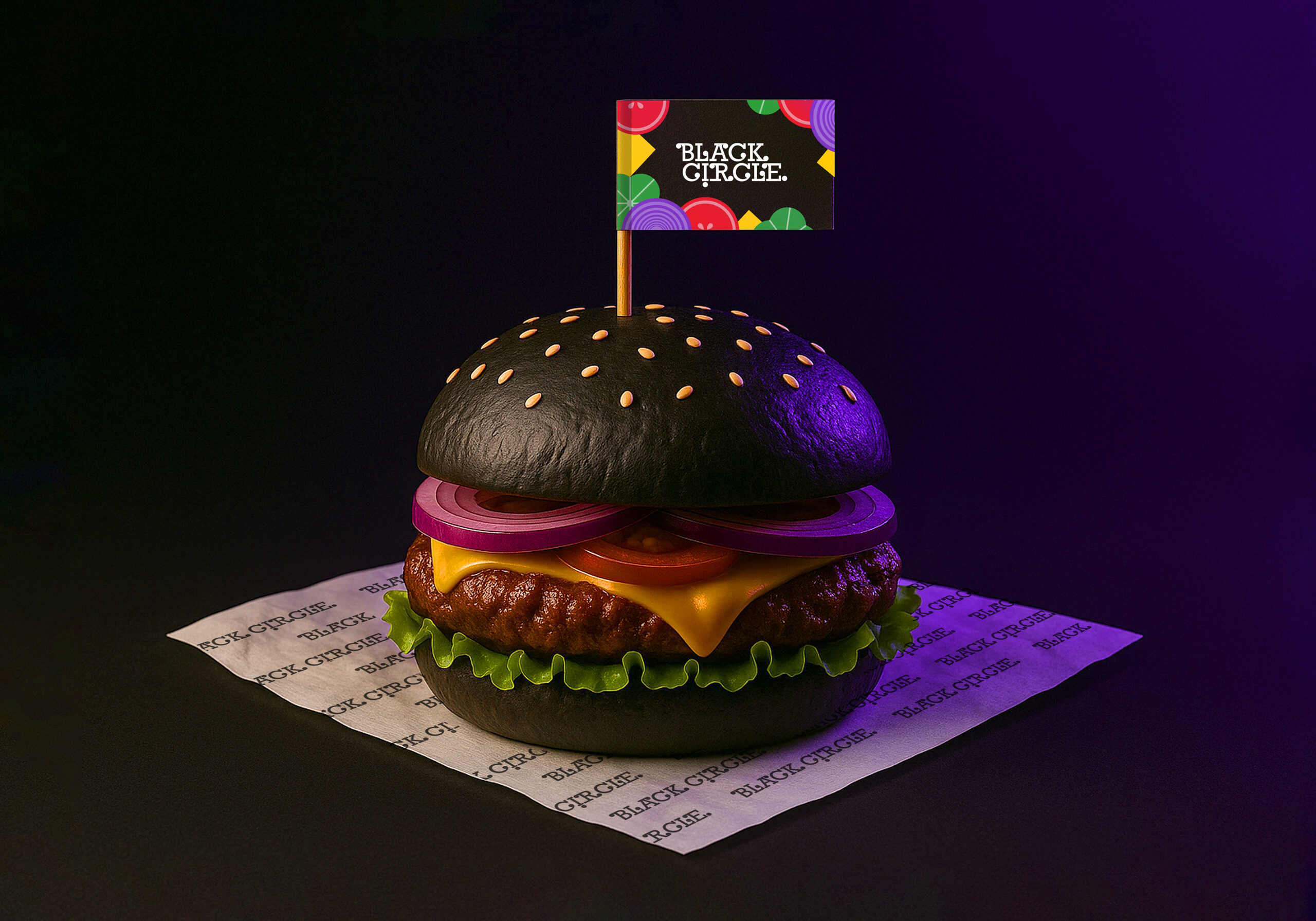
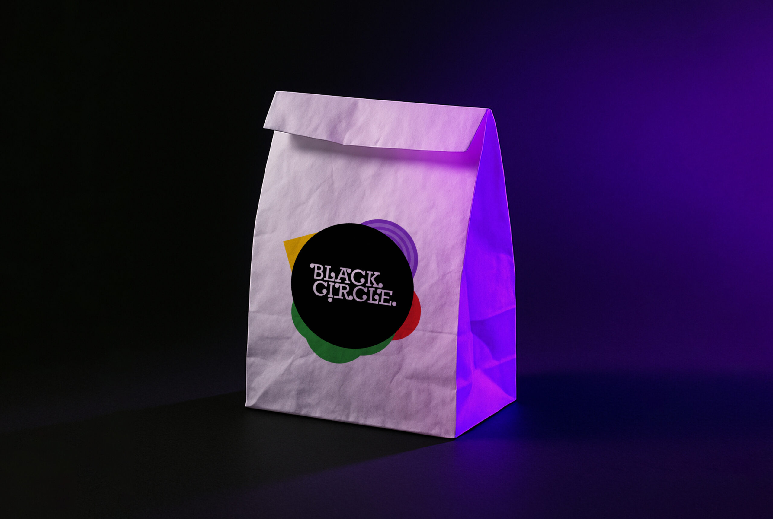
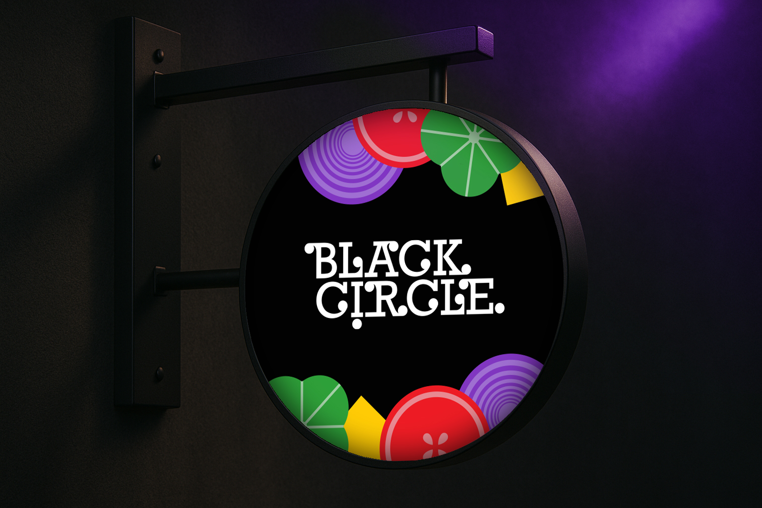
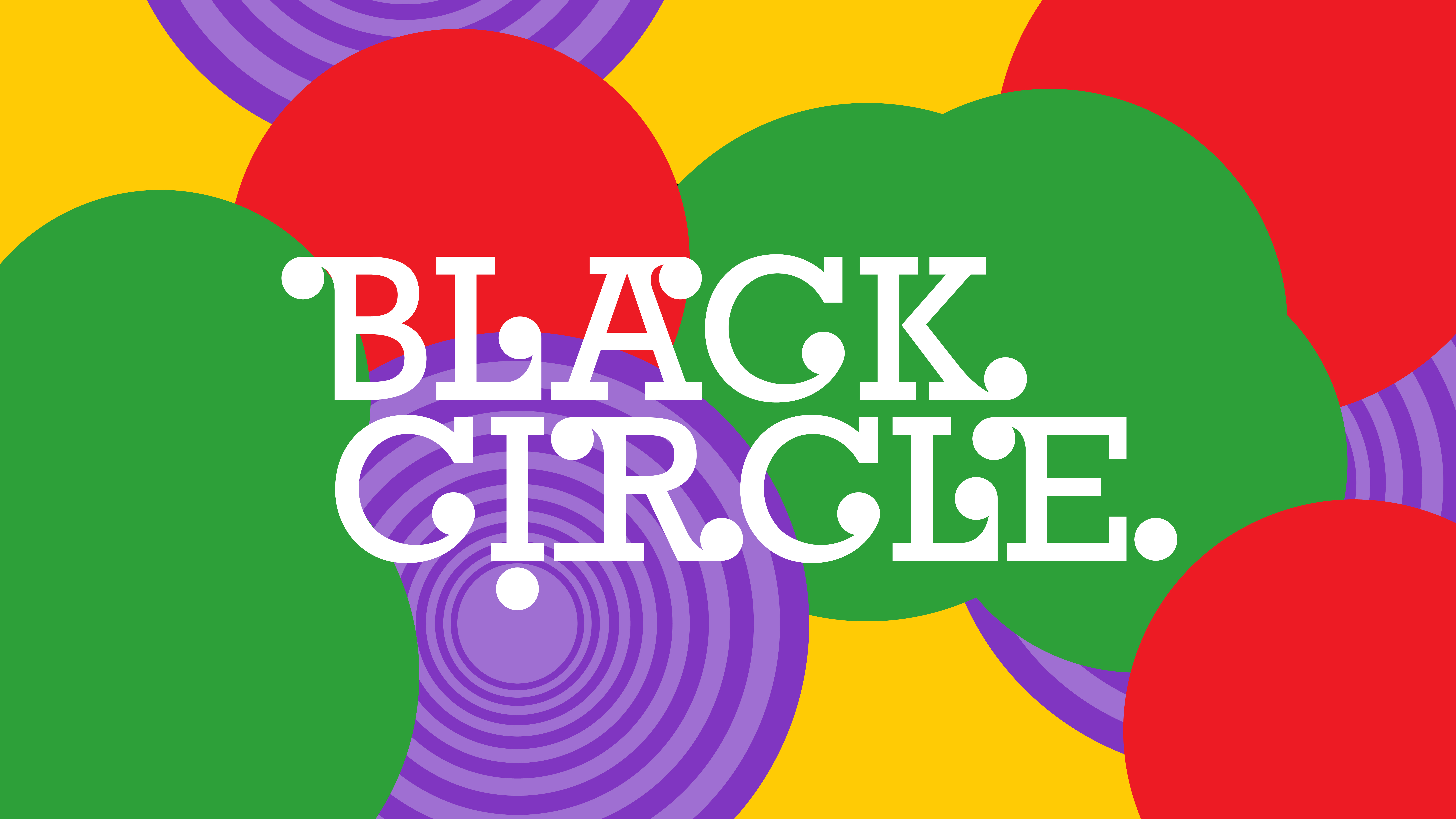
The first step in this branding project was naming. Black Circle is a burger store based in Tehran, known for its signature black buns. Since burgers are universally recognized as circular creations wrapped in flavor, we distilled this form to its purest essence and named it Black Circle, a simple yet bold name that captures both the visual identity of the product and its distinctive character.
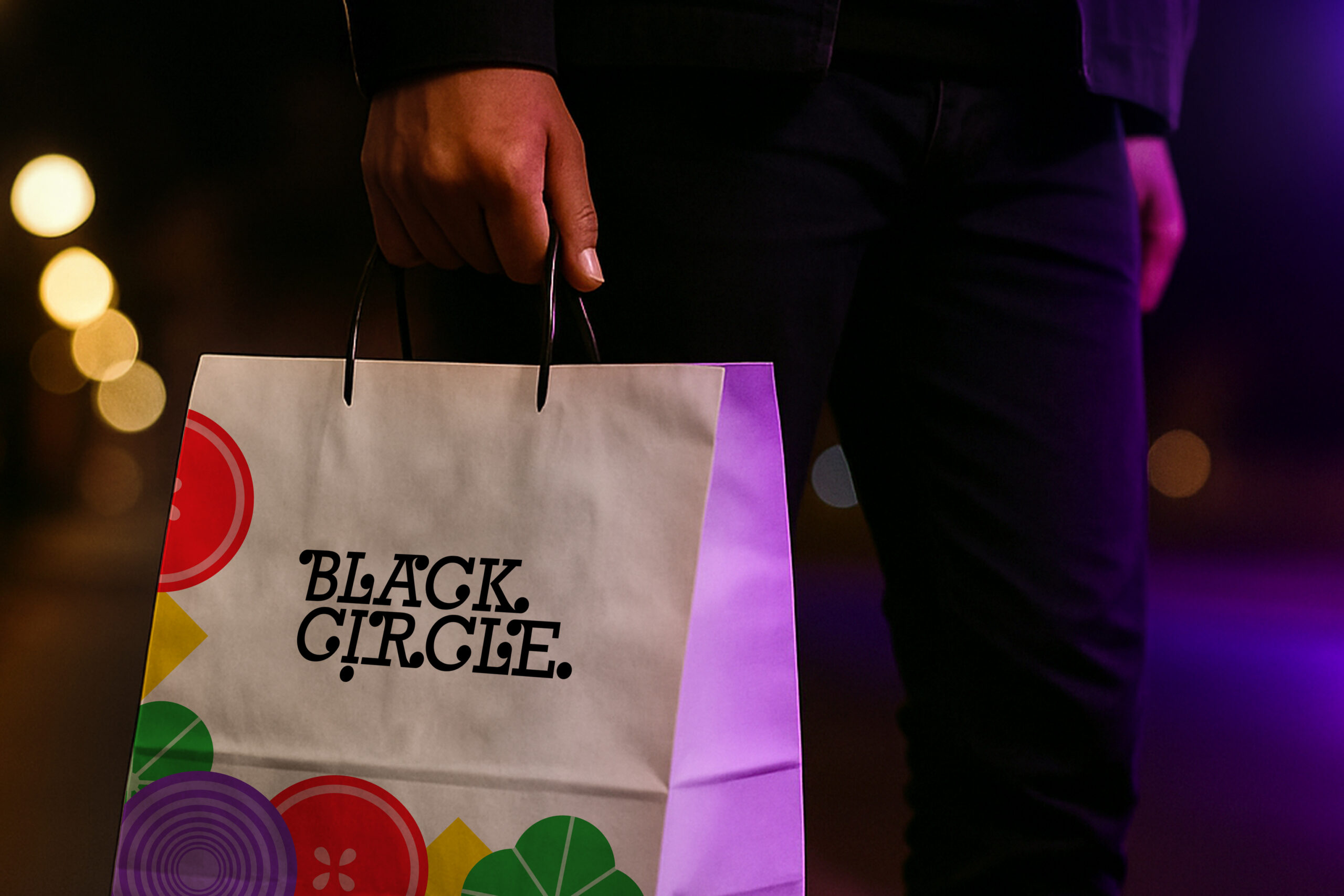
Black Circle is a small, welcoming burger shop,
designed for grabbing a delicious bite in a casual, friendly atmosphere. Black Circle is a small, welcoming burger shop designed for grabbing a delicious bite in a casual, friendly atmosphere. The brand identity reflects this warmth, simple, approachable, and inviting, much like sitting with your favorite people and savoring a perfectly crafted burger.
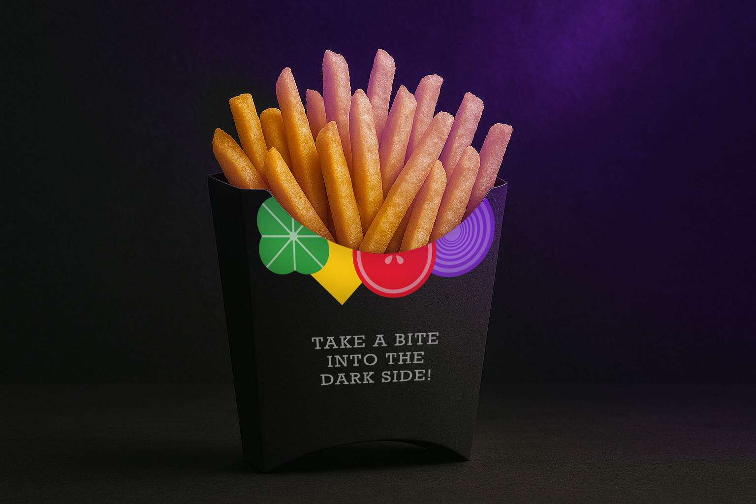
A Bite into the Dark Side
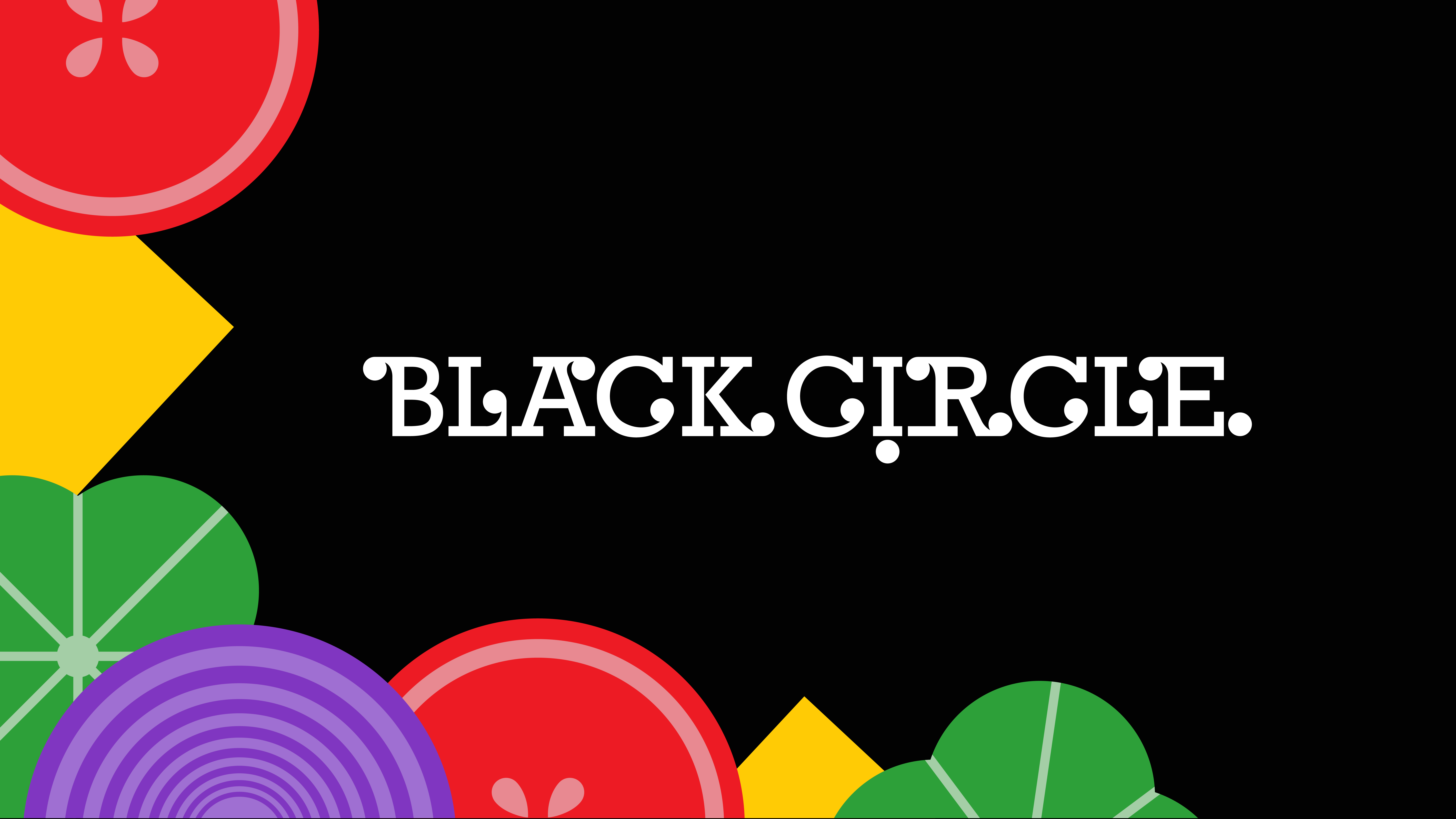
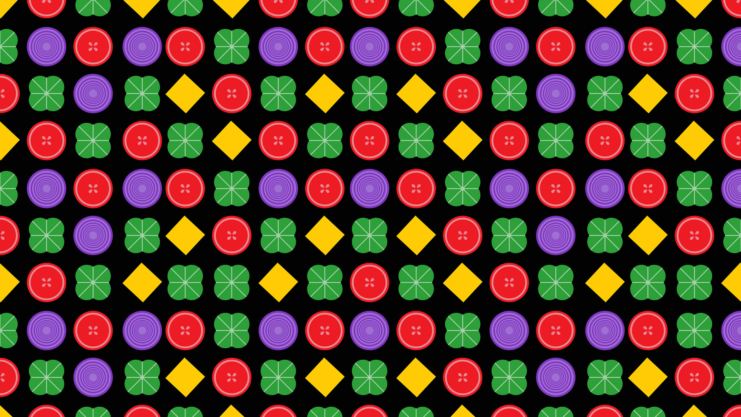
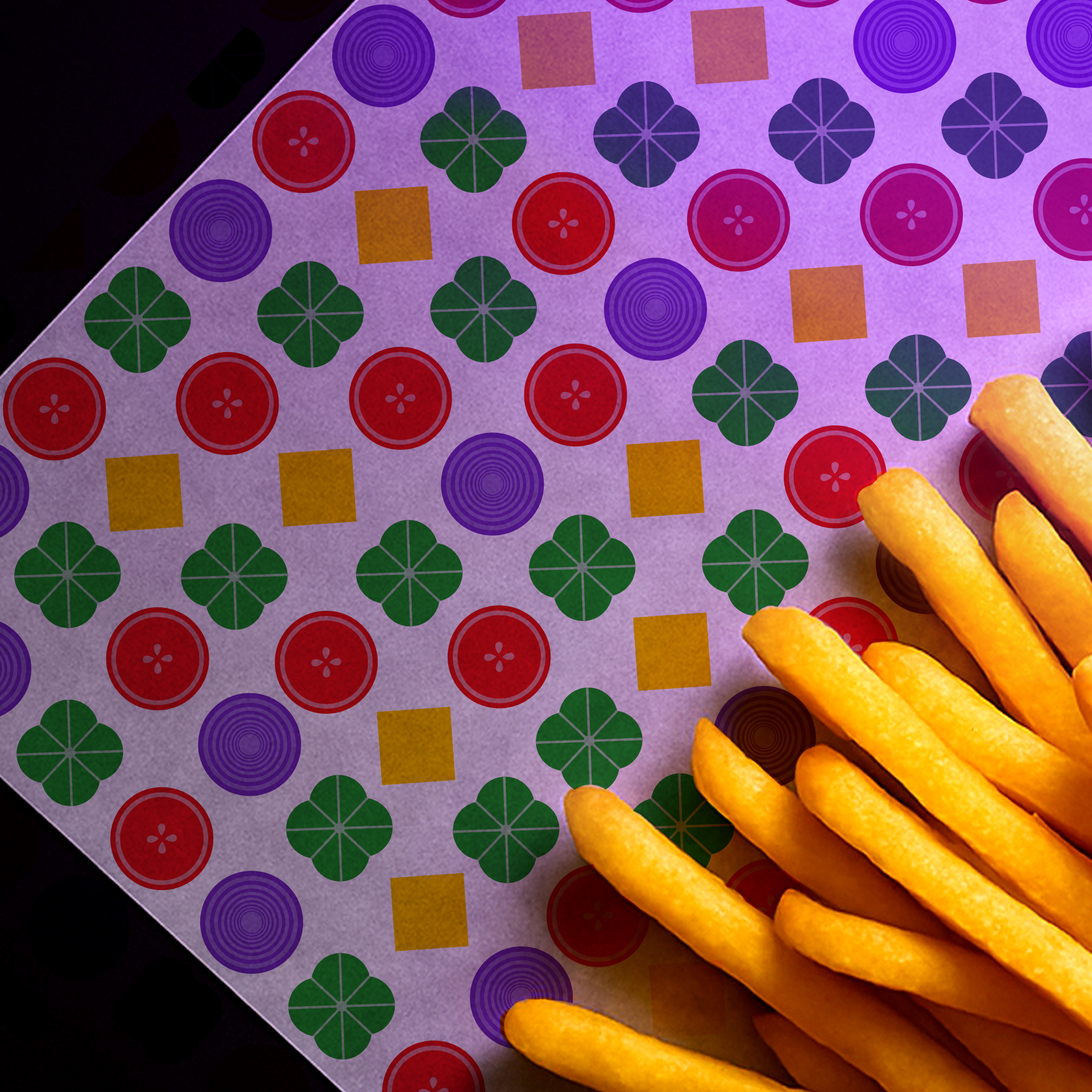
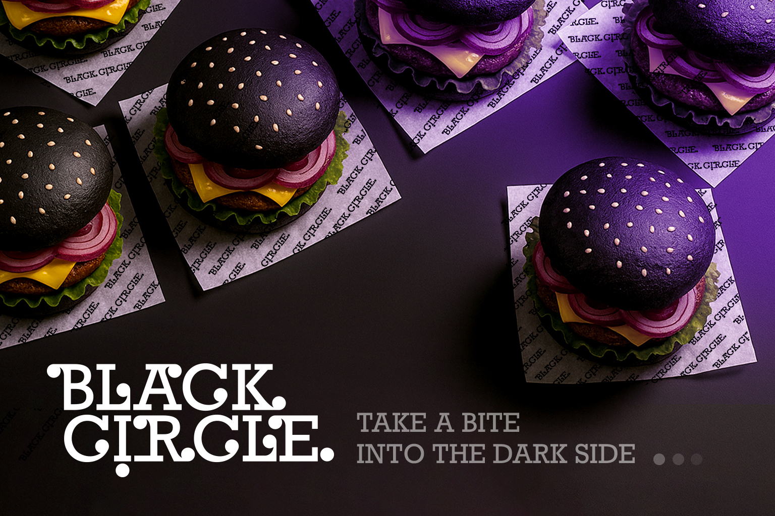
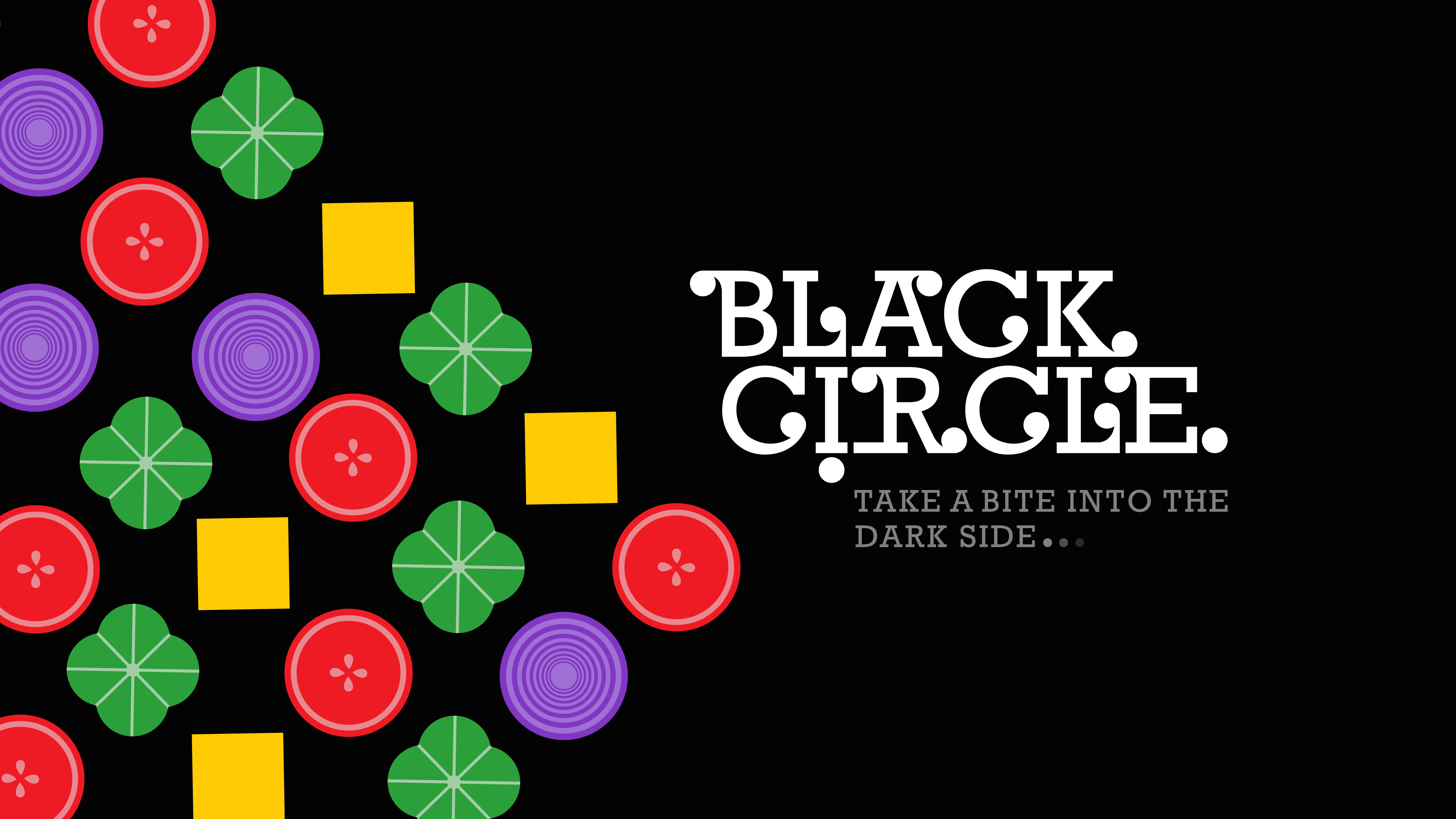
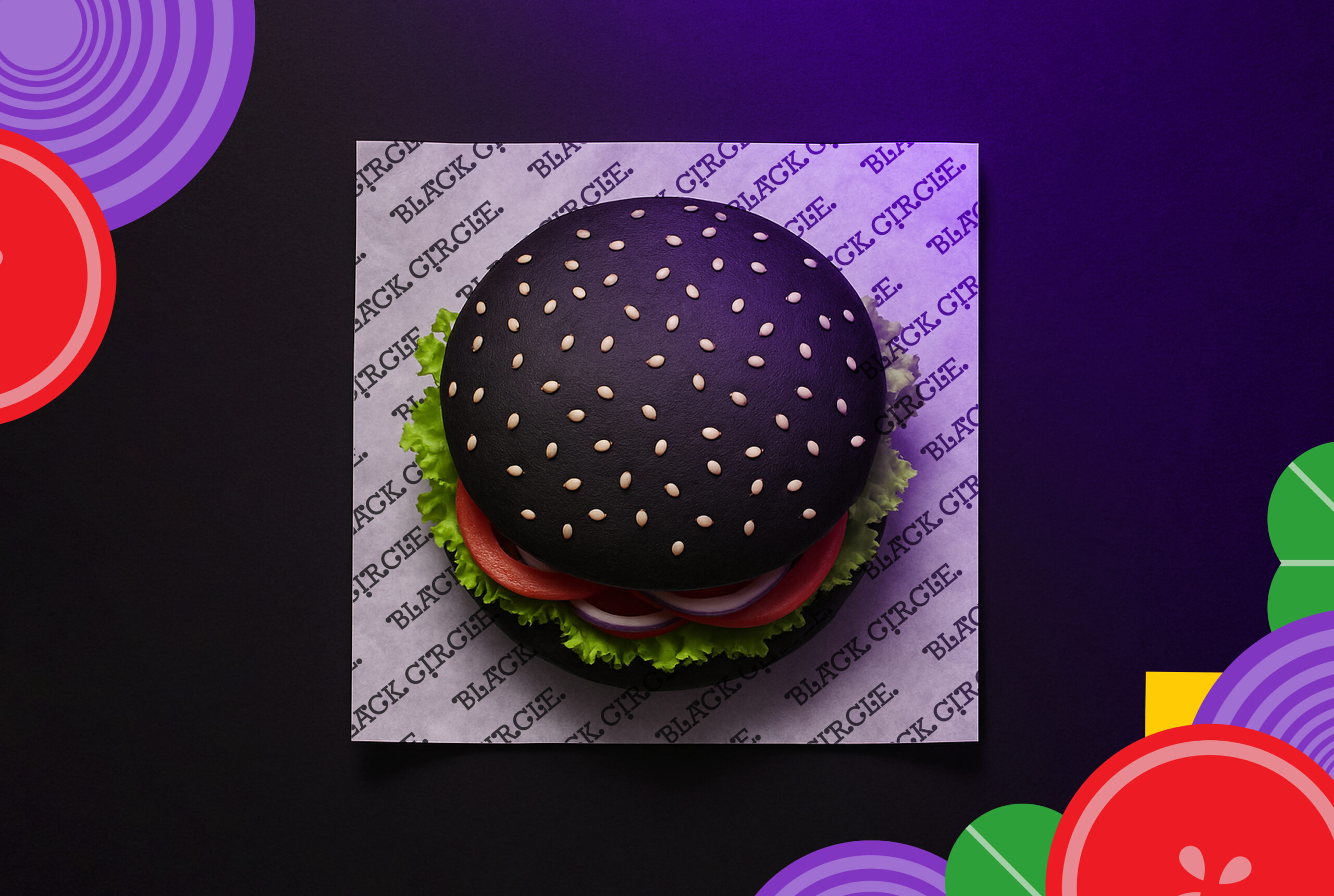
To align with the visual concept, we created the tagline: “Take a bite into the dark side.” Inspired by the boldness of the black bun and the simplicity of form, we developed a visual identity using minimal shapes that echo the elemental parts of a burger. These forms became the foundation for custom patterns, brand assets, and a clean, modern logo, resulting in a sharp and fresh identity that feels both elevated and effortlessly simple.
The label is printed in 206 mm x 140 mm and applied to a glass bottle. The bottle dimensions are 100 mm x 240 mm, (750 ml) designed to complement the intricate metallized print. The combination of high-quality materials and detailed illustration enhances both visual appeal and tactile experience, creating a premium look that reflects the product’s identity. The project began in July 2024 in Vancouver, Canada, and is an ongoing design process focused on Noosh’s upcoming products. It is now available in several provinces across Canada.
Bronze award winner project from world brand design society / 2024-2025